Dear Team17,
Worms 2 was one of the best games of the late 1990s. I remember playing it countless of hours, designing my own maps and even playing some online games over a dial-up connection. Those were the days!
Now, I recently bought Worms Reloaded from Steam. I figured Worms would be a perfect, simple yet entertaining game to play on my Asus EeePC 1101HA netbook. Well, I was wrong. I couldn't even get past the initial profile creation screen, the game wouldn't work well enough. It probably has to do with the lousy GMA500 graphics chip, but still I would've thought that a game whose looks haven't really changed in 10 years would have worked. Lazy programming? I even tried searching through the game's configuration files to see if the resolution could be changed by editing them, but no luck.
Anyway, I then tried the game on my desktop computer and sure enough, this time it started without a problem. However, the first WTF-moment came right in the beginning: I was asked to create a team but I could only set names for four worms?! Four? As in half-of-the-previous-maximum-of-eight? Seriously? More worms equals more fun, so why on Earth would you reduce the amount of worms per team?
Then I tried playing a game with my newly created team. The main menu already has ten different options but I chose the one where it says "Single Player". Now, a menu of seven items appeared:

Huh? I suppose it's good to have some variety, but what are all these Warzones and Body Counts? There's not even a tooltip explanation for them when you hover your cursor over the menu items. Custom Game sounds like some good, old-fashioned fun so let's choose it and ignore the rest. Now the player is greeted with this screen:

Now, pay attention to this. I think this screen is an exemplary example of what's wrong with Worms: Reloaded. Over the time certain standard user interface widgets, such as drop-down boxes and scroll bars, have been developed and established as good and usable features. This screen, however, tries to reinvent everything. It took me a while to figure out how to add teams into the game. Turns out you need to click the team name between the arrow symbols to move it into the Current Teams box. The next question is "How do I get computer opponents into the game?". There's no view of all the available teams, so you need to scroll for more teams. Turns out computer players have a microchip symbol next to their names, but their difficulty level cannot be determined before adding them into the game. So, two major issues in choosing the team alone: you cannot see all the available teams at once and you cannot see the computer team difficulty levels beforehand. This was certainly done better in the previous Worms games. In an attempt to confirm this I even installed and tried Worms 2 and Worms World Party but unluckily neither one of them would even start on my Windows 7.
The next whatchamacallit on the screen is Game Style. What are these? No information whatsoever is given about them here. To find out more information about them one has to abandon the current setup, go back to the main menu, choose Customise, then Manage Game Styles, and then Edit the game style one wants to know more about. It's a bit of a hidden feature and I was surprised you could actually customize the game this much. There are four different categories of options and the menus look like this:

I find it inconceivable that even on 1920x1200 resolution only seven options are shown at once. Team17, you've got more than 2.3 million pixels at your disposal and you waste it by displaying information that could be easily fit into a thousand pixels?! The only reason I can think of is that this game has originally been designed for consoles and that the players are supposed to be sitting on the other end of the room, but you could do so much more for the PC version! The least you could do would be to scale the menus to show more items at once. Possibly the worst example of menu design is the weapon customization menu:

Really? With 2.3 million pixels you could only fit in information for one single weapon at a time? Have fun customizing all the 47 weapons, let alone comparing the settings of different game styles. I certainly don't want to create new styles or edit the old ones with this user interface, so I'm stuck with the pre-created ones. And by the way, what's with that 47 weapons? Worms World Party had more than 60 weapons! Since when have sequels been made by reducing the available options or by making menus more difficult to use? Talking about weapons, here's the in-game weapon menu:

There are less weapons than probably ever before yet the menu takes up the entire screen, as opposed to just one corner like before! Previously, the weapons were also nicely grouped by purpose: bazooka-type of weapons first, then grenades, then handguns, martial arts, explosives, animals, air strikes, and so on. Now, they are all there in one big mess. The numbers are also horribly off: for example, you cannot easily tell if you have got two or three ninja ropes left in the image shown above.
Now, back to starting the game. We have already seen that the Custom Game menu is counterintuitive and is trying to conceal as much useful information as possible. It does very little to actually allow the player to customize a game. So after setting the teams and clicking Start Game, the game, well, does not start. Instead, you get to choose a landscape. The random landscape generator looks like this:

Looks nice enough but you quickly get frustrated: creating a new landscape takes about two seconds. Forget about Worms 2's instant new random landscape button, the ability to enter a textual random seed for new landscapes and the nice and clear landscape profile view. Now, you'll have to watch an animation of horizontal and vertical scan lines going through the screen and then the random objects are placed around the landscape! The buttons that choose the theme and terrain shape also exhibit the "click to cycle" behaviour known from other menus already, so if you know that you want to play a pirate-themed cavern level you may end up having to click many times and watching the new landscape creation animation equally many times. And all I wanted to do was to play a fun game of Worms! Because of the random landscape generator's repulsive controls you might as well keep playing quick games instead because selecting the landscape is not fun.
Anyway, after selecting a landscape you finally get into the game (to be plagued by the weapons menu). Here's an in-game screenshot:
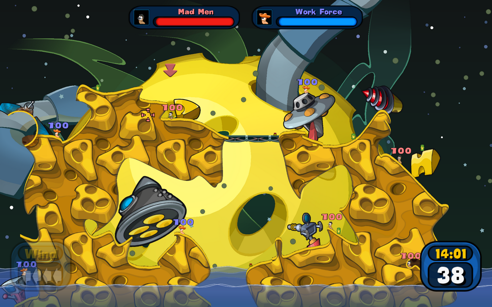
Yep, the entire playing area fits into one screen (if you zoom out). It just doesn't feel right: it has never fit into a single screen at once so why cannot it be bigger now as well? It may be just an optical illusion caused by the large resolution in use but still. And look how sparsely the worms are placed! You could certainly have bigger teams as well. Luckily the actual gameplay is still pretty fun.
As a conclusion, I've got mixed feelings about Worms: Reloaded. I really would like to like it and it seems to be the only Worms that works on the current computer systems. However, the counterproductive user interface is taking much of the fun out of the game. Team17, if you've got a UI designer then why don't you listen to that person? Or if you don't have one then hire one quickly! Finally, and I hope this is not the case, if you do have got a user interface designer and that person did design all those crappy menus, please fire them or at least give them a serious warning. Wrapping up, the most serious drawbacks of the game are:
- user interface tries to conceal as much useful information as possible
- weapons menu: lacking many weapons, fills up the entire screen and is not organized
- the maximum size of a team is only 4 worms
In case you decide to publish yet another sequel then I suggest you call it something like Worms: Resurrection and get back to basics instead of coming up with six new single player modes.
Ei kommentteja:
Lähetä kommentti