About a week ago I made a post about browsers, namely alternatives to Internet Explorer, and I recommended Opera. I also promised some tips on how to get more out of it, so here goes.
In a netbook the screen space is usually quite limited. However, many sites are designed with larger screen resolutions in mind and may have, for example, excessive margins or too large navigation menus. You may not even have thought about it before, but wouldn't it be quite nice to customize the layout of some sites a bit? With most browsers, including Opera, this is actually possible. You will need to know some hypertext markup language (HTML) and cascading style sheets (CSS) but that's pretty much all it takes. If you use style sheets created by other people then you don't even have to know those.
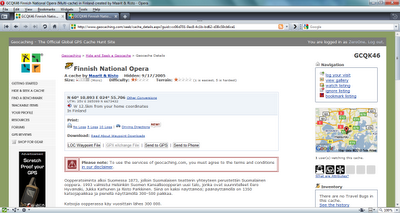
Anyway. Take geocaching.com. The individual cache pages actually have a lot of clutter: buttons, linebreaks, information that is just not used. Here's a screenshot of a cache page as they typically look like:

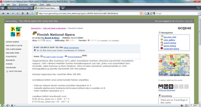
You'll notice that there is so much extra information that the actual cache description barely even starts on the first screenful. Using a custom style sheet you can strip the unwanted elements out of the page:

How many differences can you spot and which version of the page would you rather use? To achive this result I used this style sheet. You may copy it and save it anywhere in your computer. How to take this file into use then? Here are the instructions for Opera:
- Direct Opera to www.geocaching.com
- Hit F12
- Select Edit Site Preferences...
- Choose the Display tab
- Into the My style sheet box, select the CSS file you hopefully just downloaded
- Hit OK, then refresh geocaching.com
Presto! Your geocaching.com browsing experience has vastly improved. :)
Ei kommentteja:
Lähetä kommentti